Table of Contents
Prompts I see everywhere are very bad in my opinion.
They're sometimes fancy, full of bling which amazes coworkers, but usability nightmares.
What and Why
In my opinion, a prompt should strive to be:
- short, very short, both to be readable and to let as much space as possible for your commands
- easy to spot, you don't want to have to search them when scrolling
- not painful to the eye and not making it harder to read the surroundings
- informative but not more than what's necessary, it's not the javadoc of your console
A prompt should not contain information you don't need.
Displaying your git branch or status is better solved by other tools, and really, do you use the other bling you see in those photogenic prompts ?
And you don't want to waste space with decorations. Triangles are cool but having your command in one line and being able to tile many consoles on the same screen are more important.
To me, here's what's usually needed:
- the working directory : it's really important
- the user : it depends on the situation but it's often important
- the host if you switch between several of them
At work I mostly need the host and the path. I don't even display the user in my common prompt but I want the server well visible.
At home I need the user and the path. I display the host only when connected to a remote one.
At work there's a danger related to the wrong host, and at home to the wrong user (especially as my home computers are also used by my very young kids).
So in both case I add color emphasis related to that critical information: the host or the user.
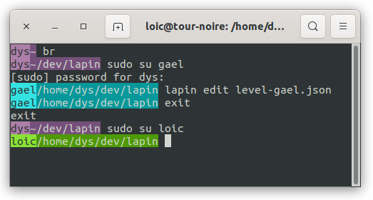
Here's how it looks at home:

Even the 4yo Loïc won't fail to notice he's connected to the wrong account.
The biggest trick here is to use the background:
- it's easy to spot and it's visually in a different realm or level than the other console content
- it makes it possible to drop separator chars
- it's now available on all your usual consoles, even with the most buggy multiplexer
- even when you don't look at it you'll notice it if it's not the one you expect
At this point I should precise it's not something you can normalize at a big scale, as some people don't see colors and evidently color codes don't scale well. But most of your console use is very personal and based on dozens of personal shortcuts and tools. A shell customization is tailored for a very small number of users (usually one).
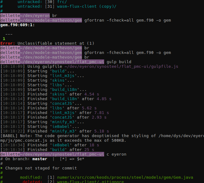
Here's what an usual session at work looks like:

("dellette" is the name of my work laptop, the color and first parts are different when connected to a server)
Even when commands dump pages in the console, it's easy to spot their start when scrolling.
Use my prompt maker
I've made available online a bash and zsh prompt designer:
Or do it yourself for bash
A user-path prompt

Add this to your ~/.bashrc:
PS1='\[\e[30m\e[105m\]\u\[\e[00m\e[45m\]\w\[\e\[\e[00;00m\] '
A host-path prompt

Add this to your ~/.bashrc:
PS1='\[\e[30m\e[105m\]\h\[\e[00m\e[45m\]\w\[\e\[\e[00;00m\] '
A host-user-path prompt

Add this to your ~/.bashrc:
PS1='\[\e[00m\e[45m\]\h\[\e[30m\e[105m\]\u\[\e[00m\e[45m\]\w\[\e\[\e[00;00m\] '
Build your own prompts
You may have noticed the \h (host), \u (user) and \w (working directory) parts. If you really need other parts, for example the time (\t), here's a list.
ANSI codes and especially SGR sequences are painful to read and edit, so, instead of learning the language, I suggest you copy one of the prompts I proposed then change its colors with the following information:
A \[<colors>\] block changes the font of the terminal.
A <color> is \e[<code>m (you'll see a \033 instead of a \e in some documentations).
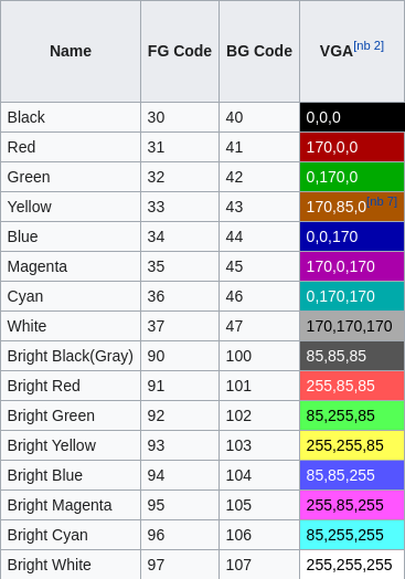
Codes for foreground and background are different.
Here's the best reference I know: ANSI 3/4 color codes on Wikipedia

We'll generally use \[\e[<foreground-code>m\e[<background-code>m\].
And the last thing to know is that we can reset the colors for the non prompt terminal content with \[\e[00m\].
For example to have a prompt with just the path in black over green

you use
PS1='\[\e[30m\e[102m\]\w\[\e[00m\] '
Or do it yourself for zsh
The syntax for zsh is a little cleaner and simpler.
To start with, you'll use the same normal ANSI color codes for both foreground and background.
Full syntax can be found here.